- Welcome
- Getting started
- Latest updates
- Foundations
-
Components
- Accordion
- Alert
- Alignment
- App Search Modal
- Aria live
- Autosuggest
- Badge
- Banner alert
- Bar chart
- Blockquote
- Bottom navigation
- Bottom sheet
- Breadcrumb
- Breakpoint
- Button
- Calendar
- Card
- Card list
- Card button
- Carousel
- Checkbox
- Chip
- Chip group
- Code
- Content cards
- Data Table
- Datepicker
- Description list
- Dialog
- Divider
- Drawer
- Field Set
- Flare
- Flat list
- Flight leg
- Floating action button
- Floating notification
- Form label
- Form validation
- Graphic promotion
- Horizontal navigation
- Icon
- Image
- Image Gallery
- Infinite scroll
- Info Banner
- Inset Banner
- Link
- List
- Map
- Mobile scroll container
- Modal
- Navigation bar
- Navigation Tab Group
- Nudger
- Overlay
- Page indicator
- Pagination
- Panel
- Phone input
- Picker
- Popover
- Price
- Progress bar
- Radio button
- Rating
- Rating Bar
- Scrollable calendar
- Search Modal
- Section header
- Section list
- Select
- Skeleton
- Skip link
- Slider
- Snackbar
- Snippet
- Spinner
- Split input
- Star rating
- Swap Button
- Switch
- Table
- Text
- Text input
- Theming
- Ticket
- Toast
- Tooltip
- Touchable native feedback
- Touchable overlay
- Search Input Summary
- Content
- Accessibility
- Contributing
- Localisation
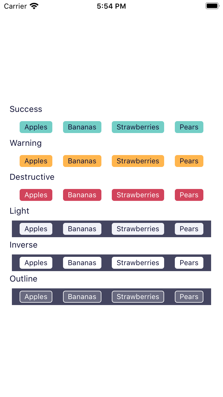
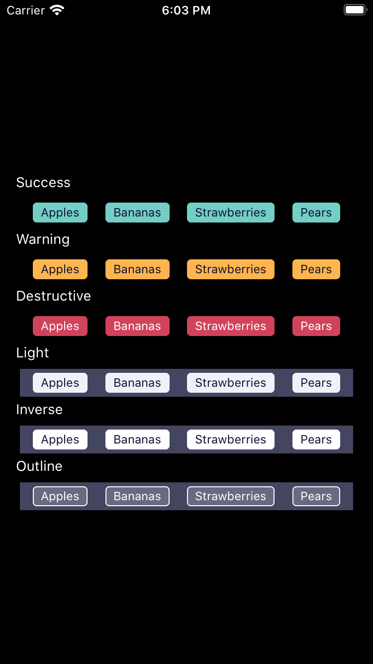
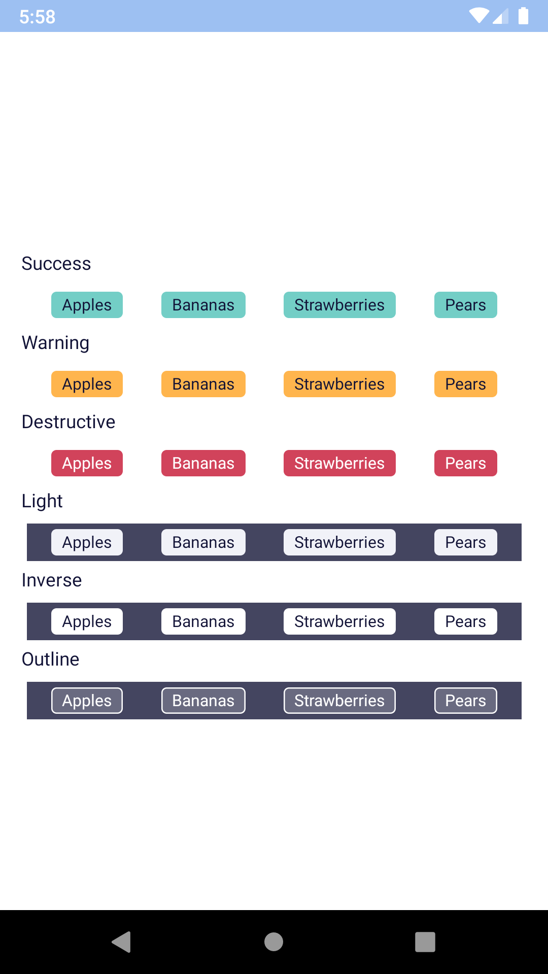
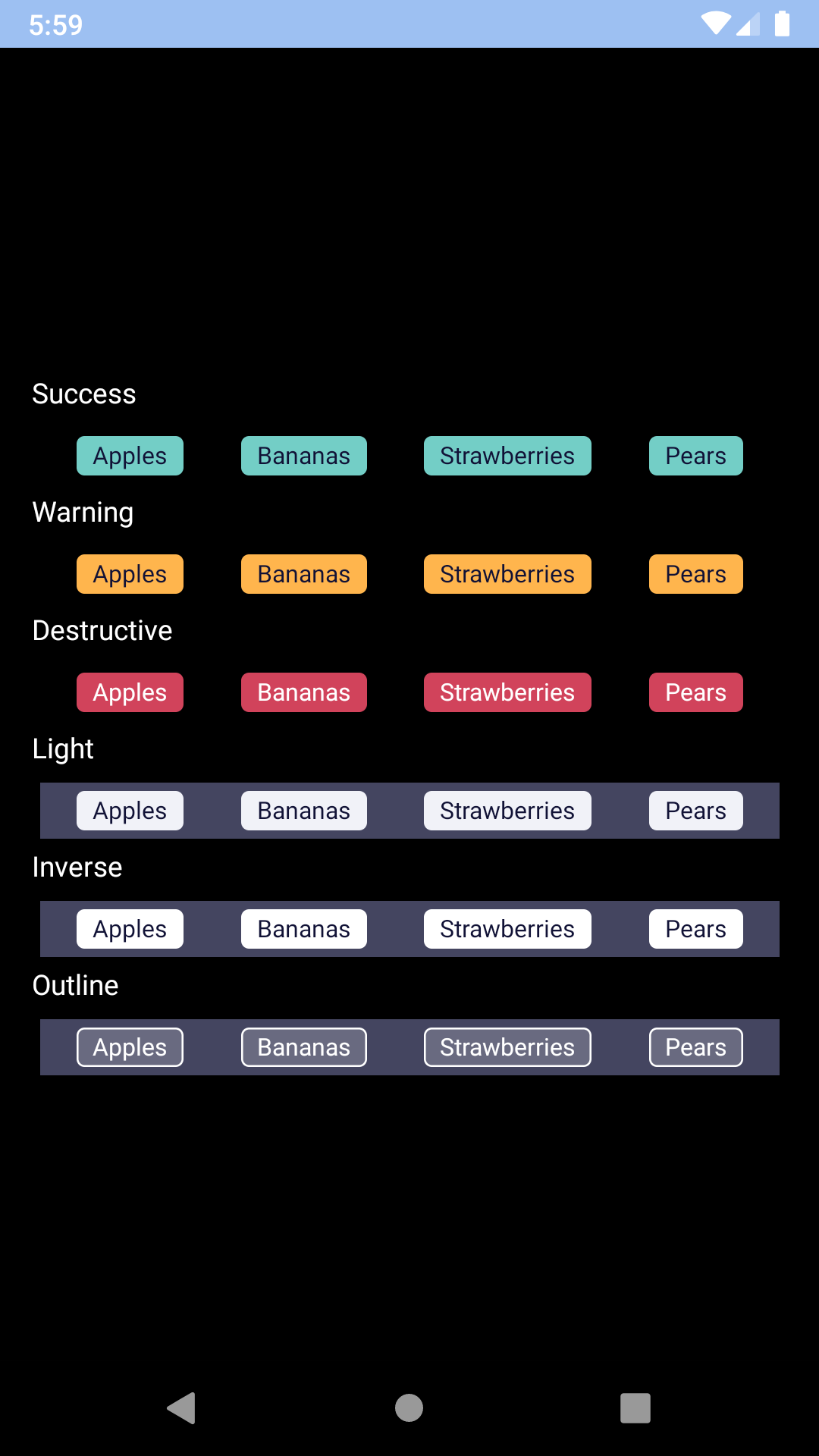
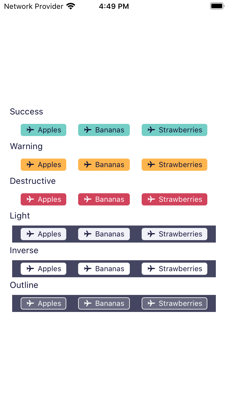
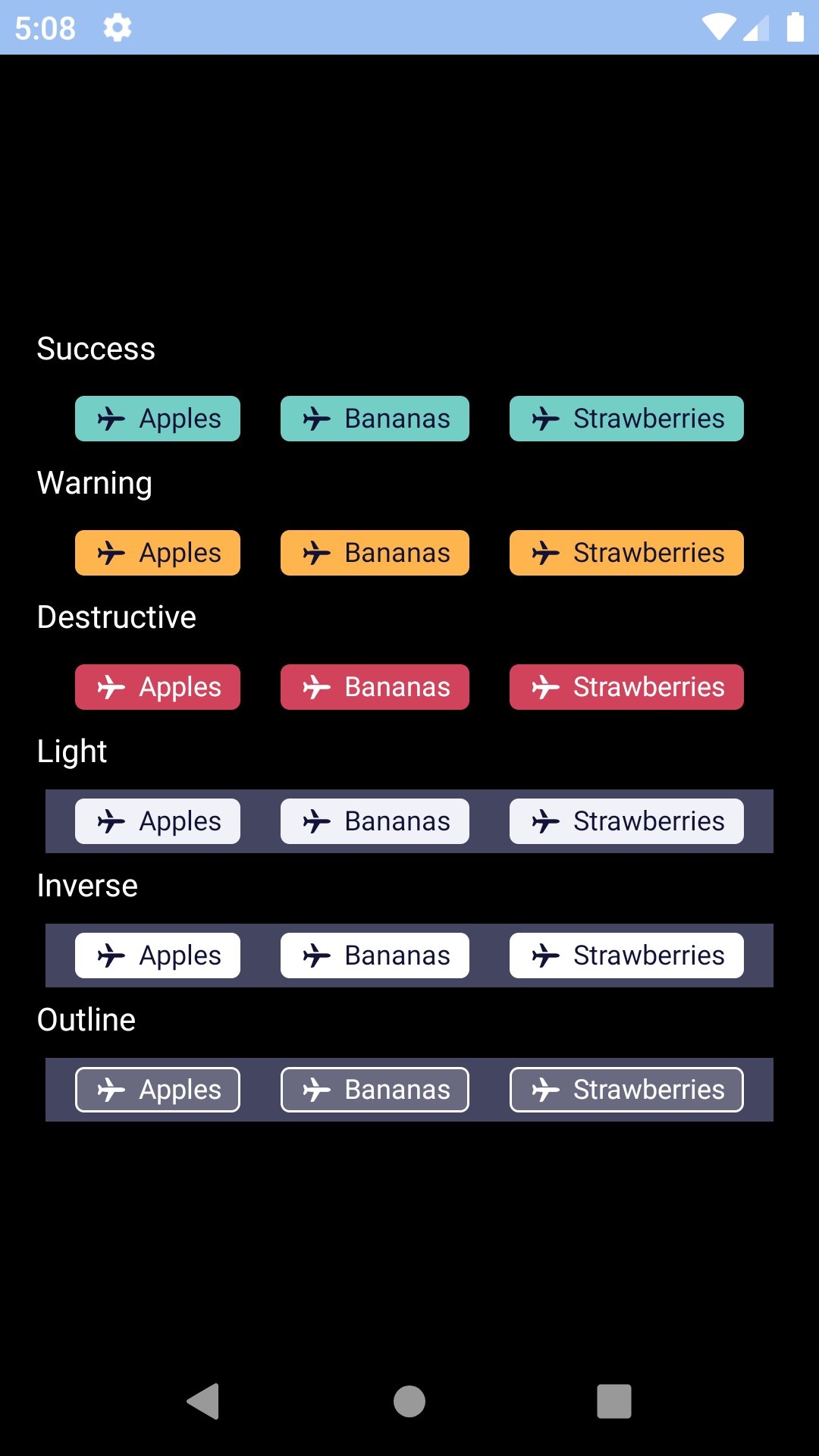
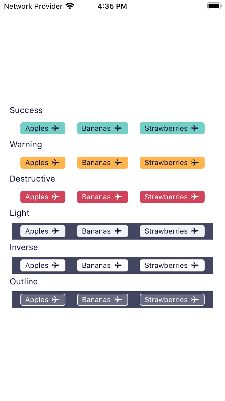
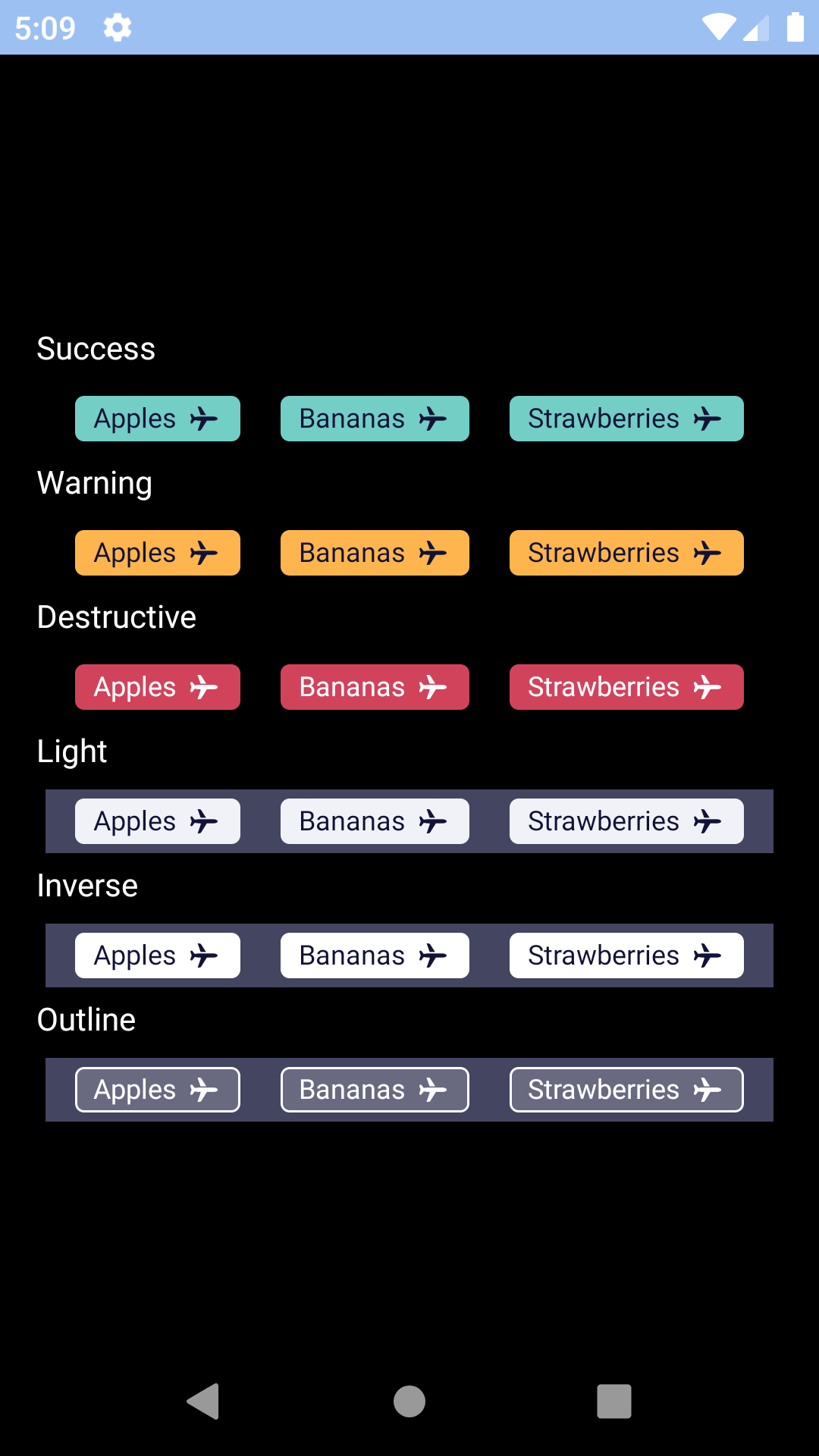
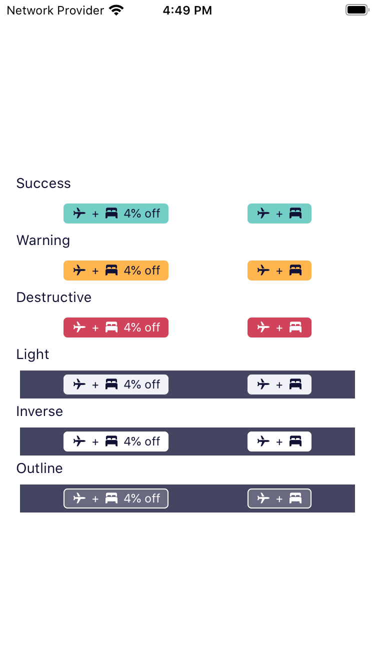
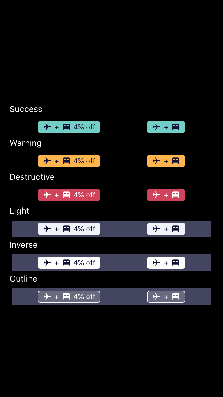
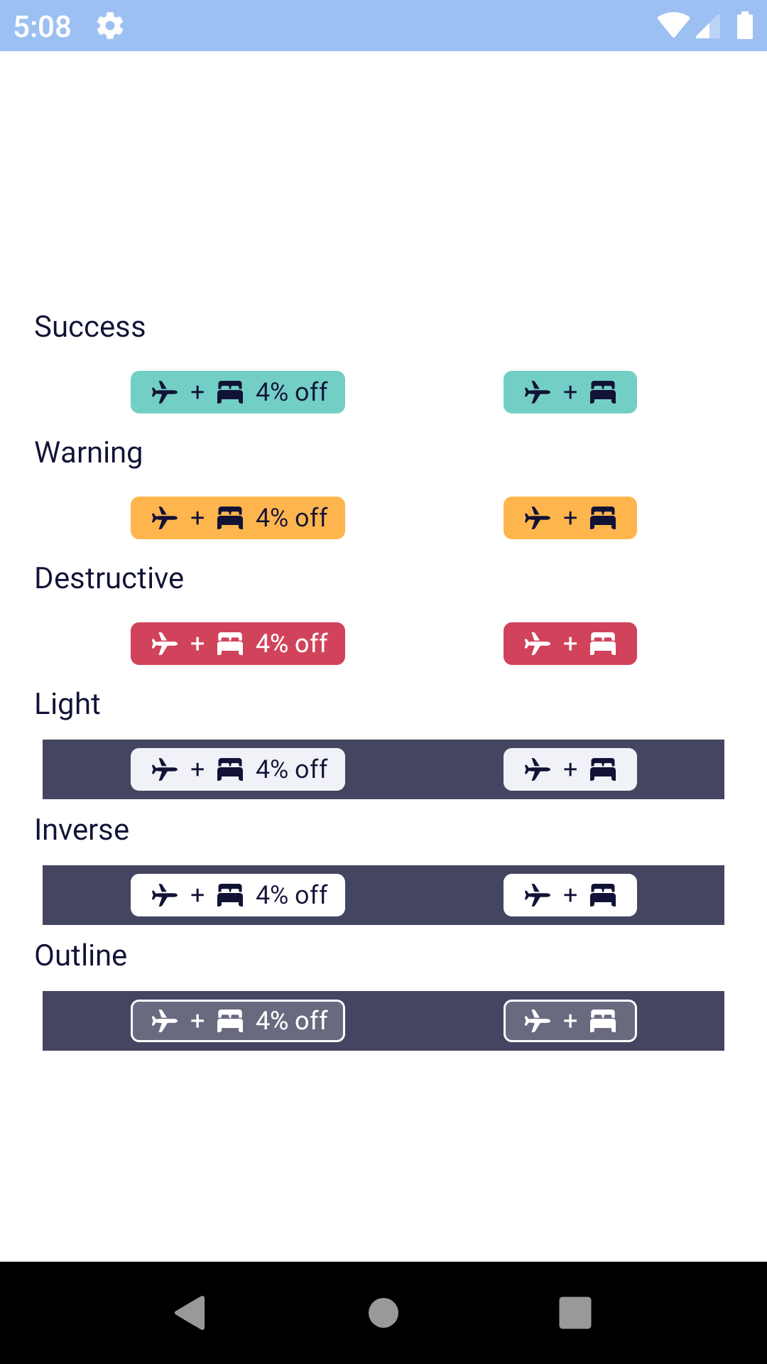
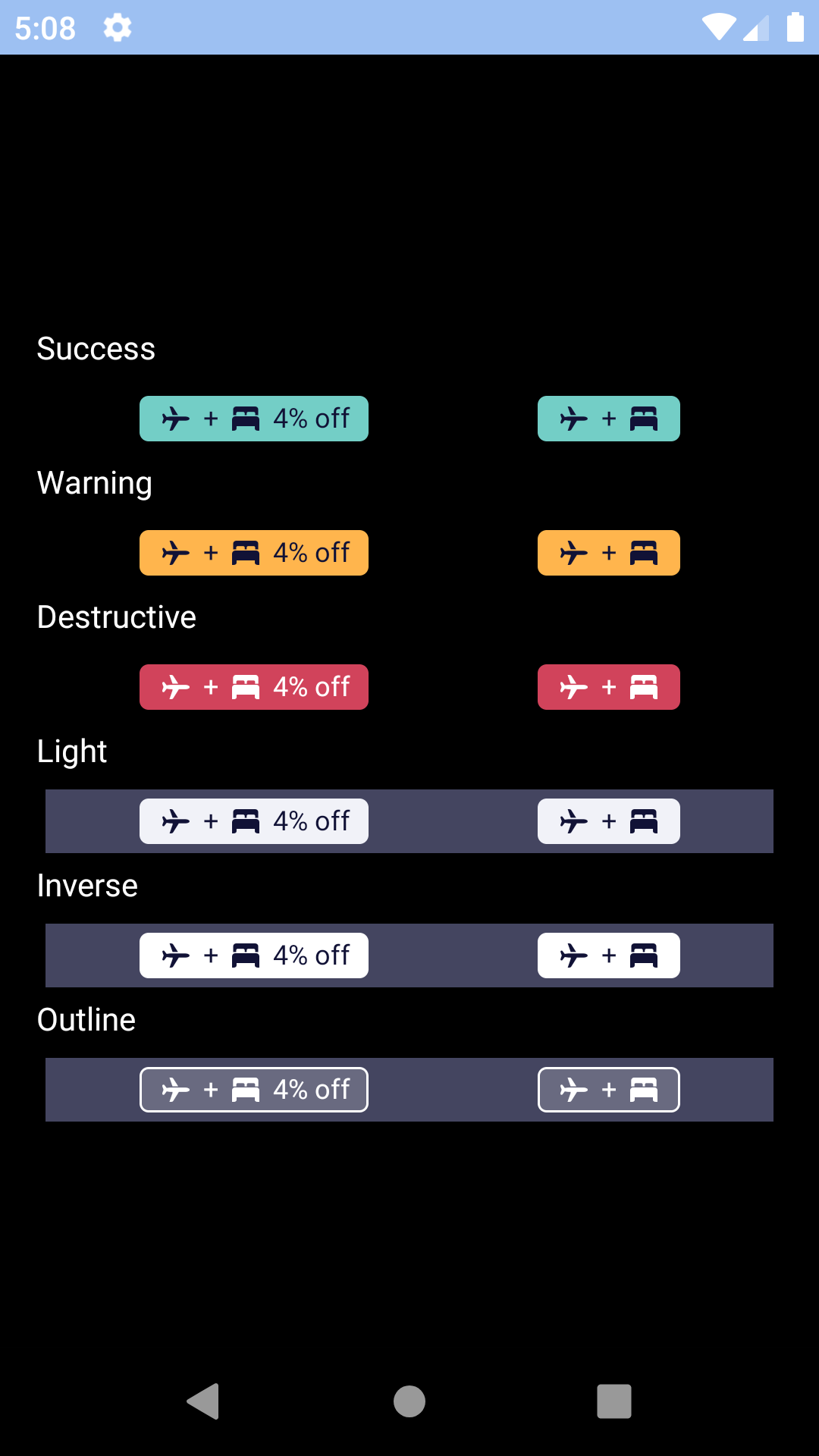
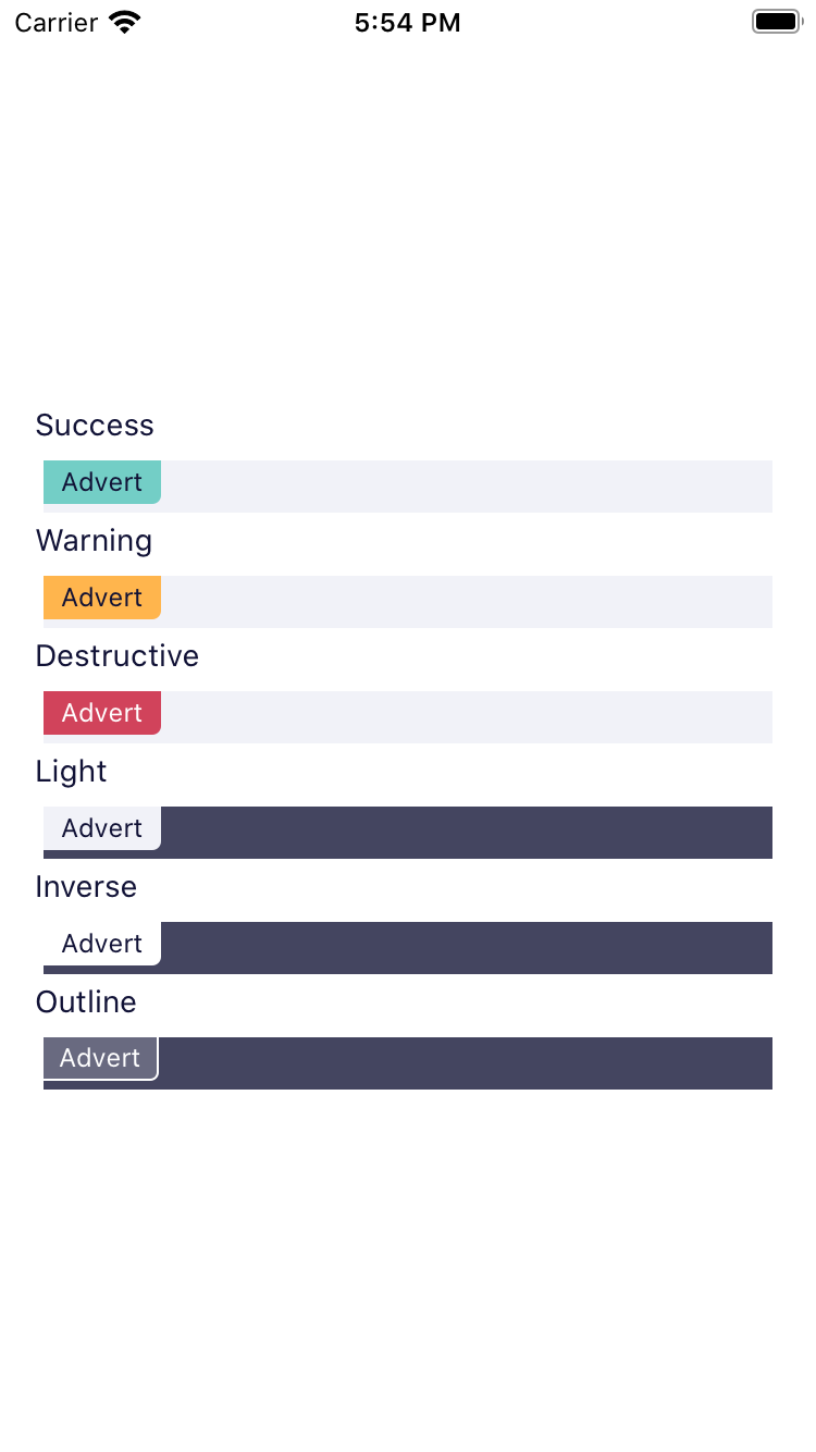
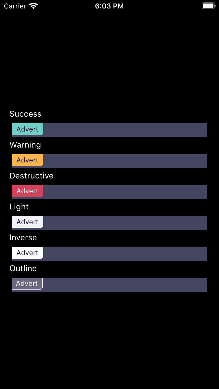
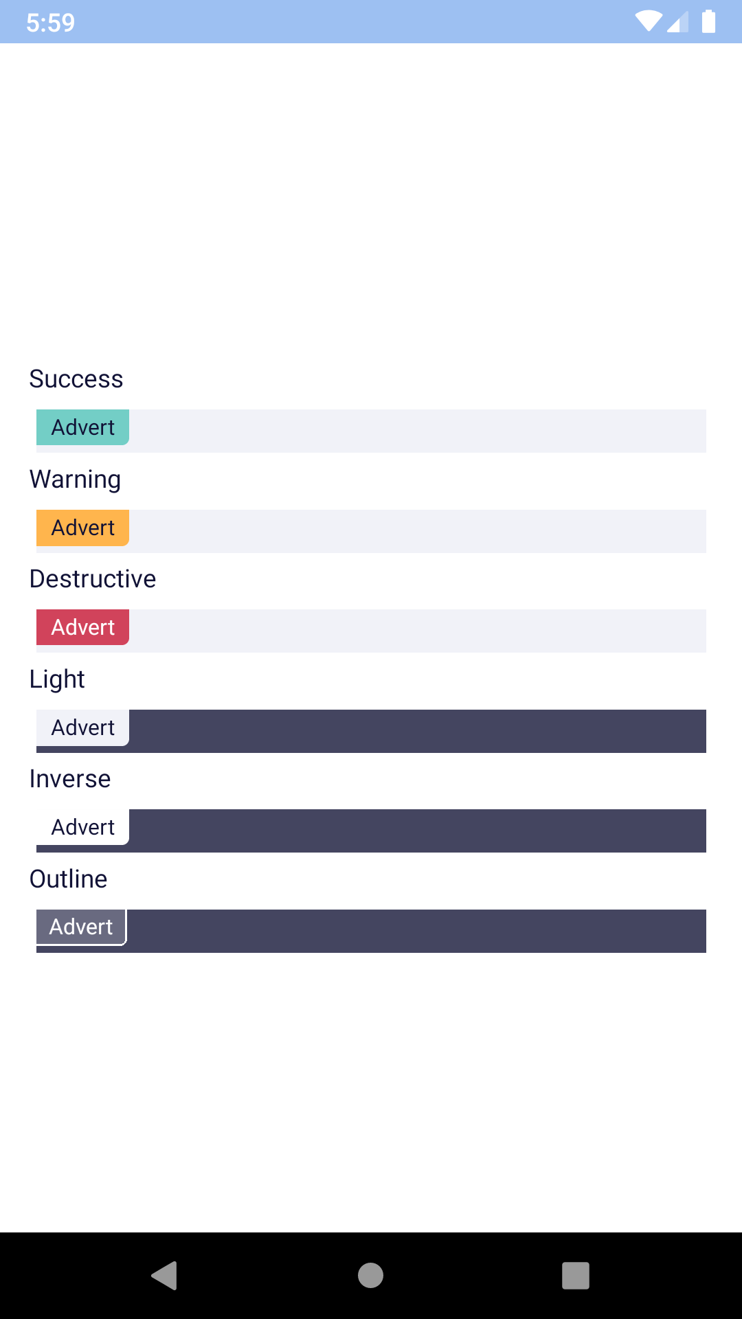
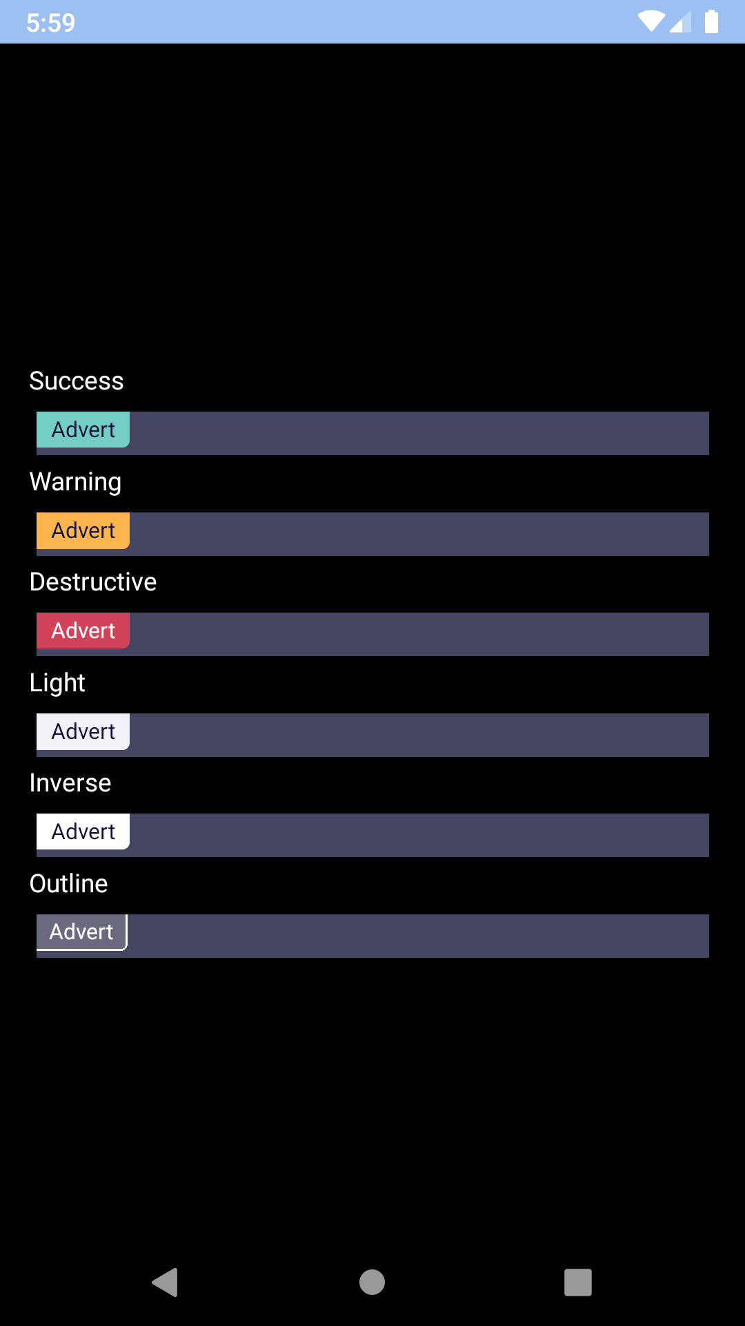
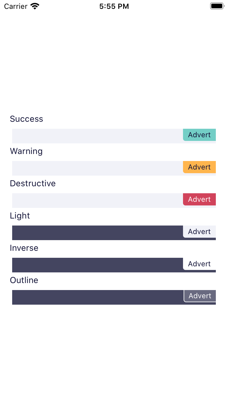
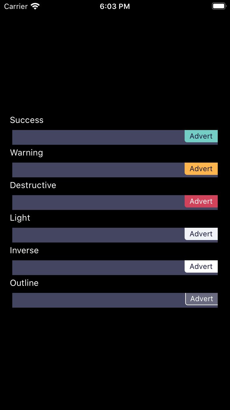
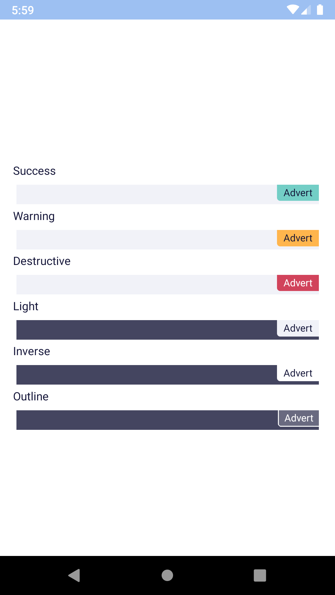
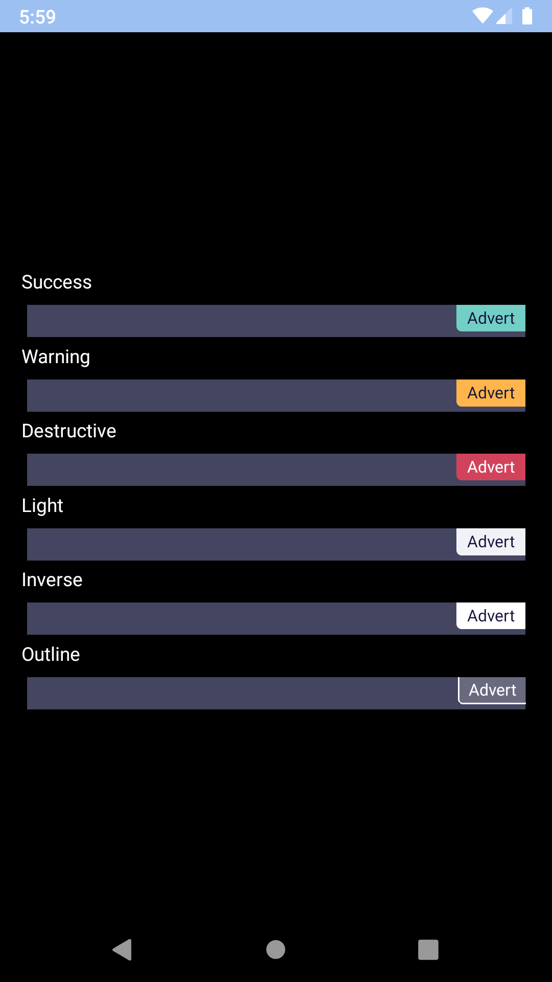
Badge
Badges are static components that show helpful details or attributes.
Unknown status
Show details
Unknown status
Status
-
bpk-component-badge
Backpack React Native badge component.
Default
| Day | Night |
|---|---|
 |
 |
 |
 |
With icon
| Day | Night |
|---|---|
 |
 |
 |
 |
With trailing icon
| Day | Night |
|---|---|
 |
 |
 |
 |
With multiple icons
| Day | Night |
|---|---|
 |
 |
 |
 |
Docked start
| Day | Night |
|---|---|
 |
 |
 |
 |
Docked end
| Day | Night |
|---|---|
 |
 |
 |
 |
Installation
Check the main Readme for a complete installation guide.
Usage
                                                import React, { Component } from 'react';
                                                import { View, StyleSheet } from 'react-native';
                                                import BpkBadge, {
                                                  BpkBadgeIcons,
                                                  BADGE_TYPES,
                                                  BADGE_DOCKED_TYPES,
                                                  BADGE_ACCESSORY_VIEW_ALIGNMENTS,
                                                  } from 'backpack-react-native/bpk-component-badge';
                                                import BpkIcon, { icons } from 'backpack-react-native/bpk-component-icon';
                                                import { spacingBase } from '@skyscanner/bpk-foundations-react-native/tokens/base.react.native';

                                                const styles = StyleSheet.create({
                                                  container: {
                                                    flex: 1,
                                                    justifyContent: 'center',
                                                    padding: spacingBase,
                                                  }
                                                });

                                                export default class App extends Component {
                                                  render() {
                                                    return (
                                                      <View style={styles.container}>
                                                        <BpkBadge message="Badge" accessibilityLabel="This is a badge" type={BADGE_TYPES.success} />
                                                        <BpkBadge message="Badge" type={BADGE_TYPES.warning} />
                                                        <BpkBadge message="Badge" type={BADGE_TYPES.destructive} />
                                                        <BpkBadge message="Badge" type={BADGE_TYPES.inverse} />
                                                        <BpkBadge message="Badge" type={BADGE_TYPES.light} />
                                                        <BpkBadge message="Badge" type={BADGE_TYPES.outline} />
                                                        <BpkBadge
                                                          message="Badge"
                                                          type={BADGE_TYPES.success}
                                                          accessoryView={
                                                            <BpkBadgeIcons
                                                              icons={[<BpkIcon icon={icons.flight} />, <BpkIcon icon={icons.hotels} />]}
                                                              separator="+"
                                                            />
                                                          }
                                                          accessoryViewAlignment={BADGE_ACCESSORY_VIEW_ALIGNMENTS.leading}
                                                        />
                                                        <BpkBadge message="Badge" docked={BADGE_DOCKED_TYPES.start} type={BADGE_TYPES.warning} />
                                                        <BpkBadge message="Badge" docked={BADGE_DOCKED_TYPES.end} type={BADGE_TYPES.destructive} />
                                                      </View >
                                                    );
                                                  }
                                                }
Props
| Property | PropType | Required | Default Value |
|---|---|---|---|
| accessibilityLabel | string | if message === null | props.message |
| accessoryView | element | false | null |
| accessoryViewAlignment | oneOf('leading', 'trailing') | false | 'leading' |
| docked | oneOf('start', 'end') | false | null |
| message | string | false | null |
| type | oneOf('success', 'warning', 'destructive', 'light', 'inverse', 'outline') | false | warning |
accessoryView
The accessory view allows for icons to be placed in front of the text inside the Badge component in conjunction with BpkBadgeIcons.
BpkBadgeIcons
Renders icons suitable to be placed inside a Badge.
Theme Props
- badgeSuccessBackgroundColor
- badgeWarningBackgroundColor
- badgeDestructiveBackgroundColor
- badgeSuccessTextColor
- badgeWarningTextColor
- badgeDestructiveTextColor
Props
| Property | PropType | Required | Default Value |
|---|---|---|---|
| icons | arrayOf(BpkIcon) | true | - |
| itemStyle | style | false | null |
| separator | string | false | null |
Made with ❤️ by Skyscanner © 2024
© 2024 Skyscanner Backpack. Page last updated on May 2, 2023, 13:42