- Welcome
- Getting started
- Latest updates
- Foundations
-
Components
- Accordion
- Alert
- Alignment
- App Search Modal
- Aria live
- Autosuggest
- Badge
- Banner alert
- Bar chart
- Blockquote
- Bottom navigation
- Bottom sheet
- Breadcrumb
- Breakpoint
- Button
- Calendar
- Card
- Card list
- Card button
- Carousel
- Checkbox
- Chip
- Chip group
- Code
- Content cards
- Data Table
- Datepicker
- Description list
- Dialog
- Divider
- Drawer
- Field Set
- Flare
- Flat list
- Flight leg
- Floating action button
- Floating notification
- Form label
- Form validation
- Graphic promotion
- Horizontal navigation
- Icon
- Image
- Image Gallery
- Infinite scroll
- Info Banner
- Inset Banner
- Link
- List
- Map
- Mobile scroll container
- Modal
- Navigation bar
- Navigation Tab Group
- Nudger
- Overlay
- Page indicator
- Pagination
- Panel
- Phone input
- Picker
- Popover
- Price
- Progress bar
- Radio button
- Rating
- Rating Bar
- Scrollable calendar
- Search Modal
- Section header
- Section list
- Select
- Skeleton
- Skip link
- Slider
- Snackbar
- Snippet
- Spinner
- Split input
- Star rating
- Swap Button
- Switch
- Table
- Text
- Text input
- Theming
- Ticket
- Toast
- Tooltip
- Touchable native feedback
- Touchable overlay
- Search Input Summary
- Content
- Accessibility
- Contributing
- Localisation
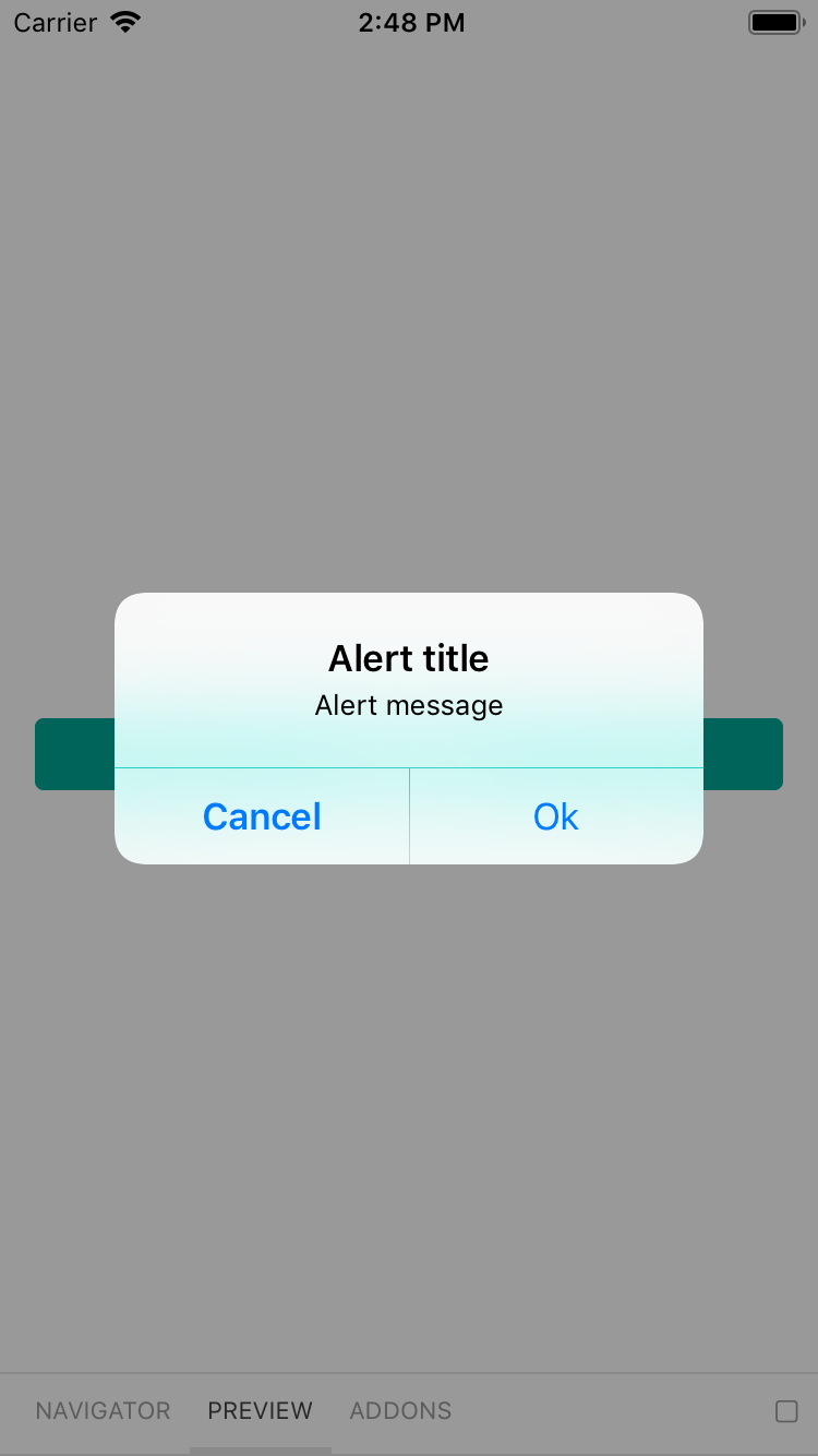
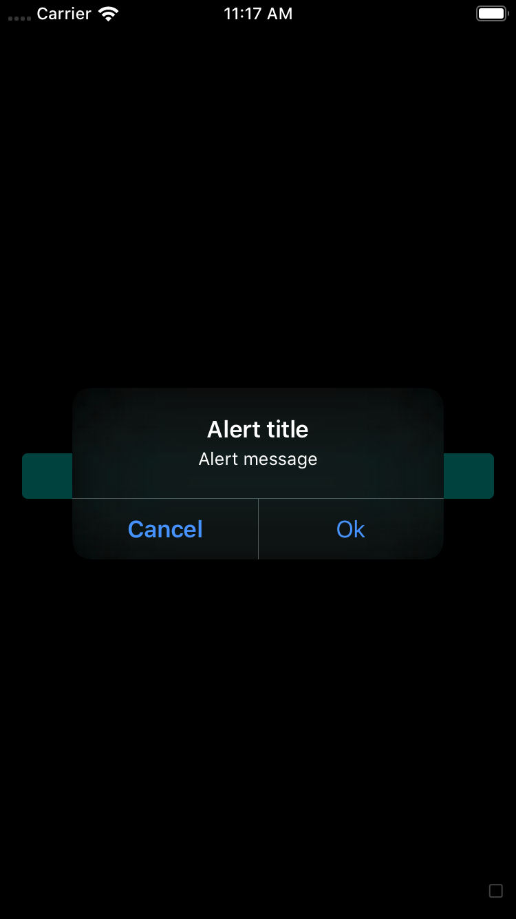
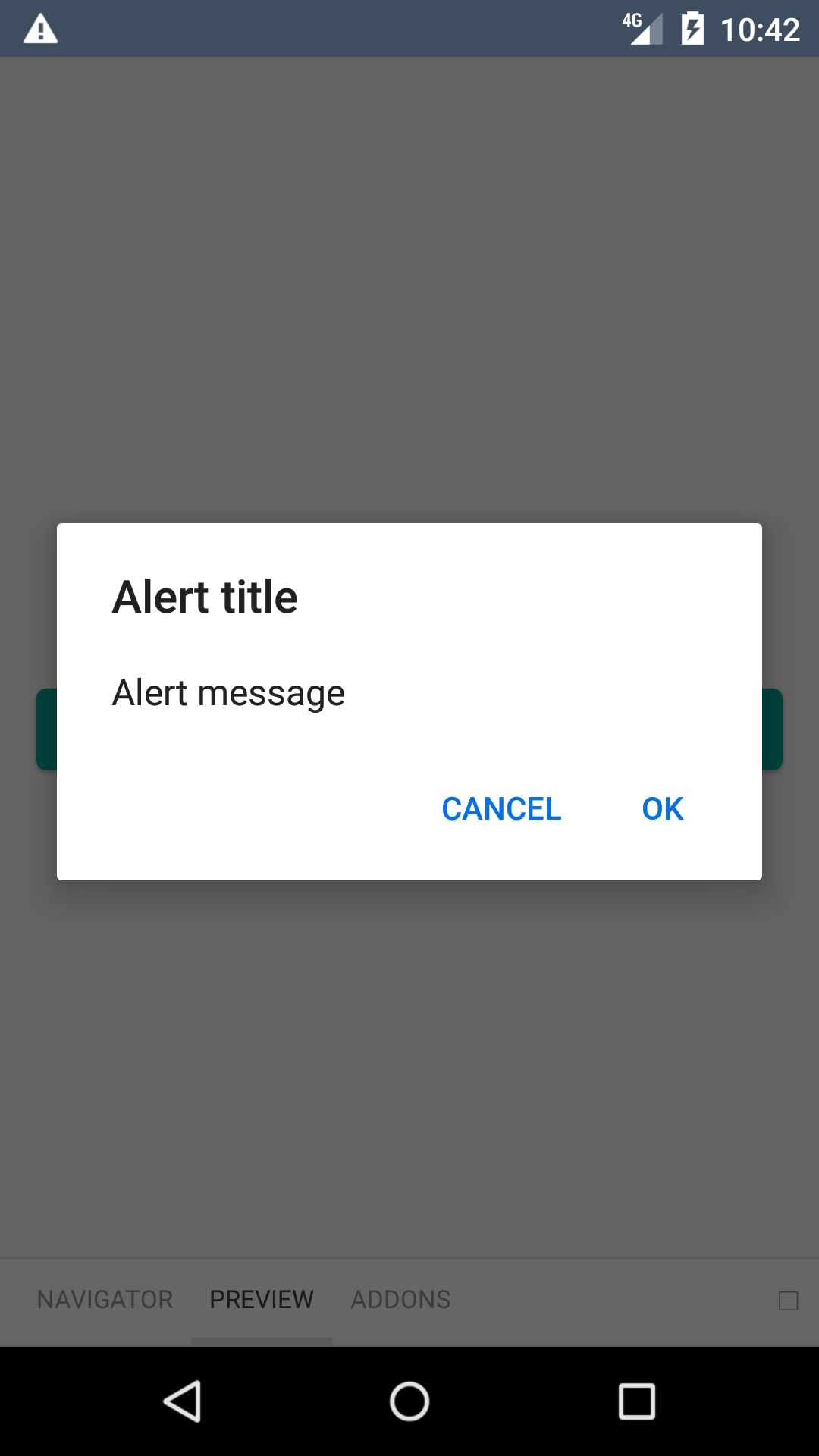
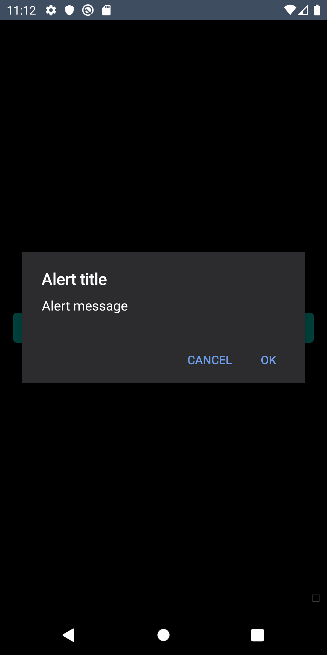
Alert
Alerts are used to provide the user with a choice of actions.
bpk-component-alert
Backpack React Native alert component.
Default
| Day | Night |
|---|---|
 |
 |
 |
 |
Cancelable
| Day | Night |
|---|---|
 |
 |
 |
 |
Three button
| Day | Night |
|---|---|
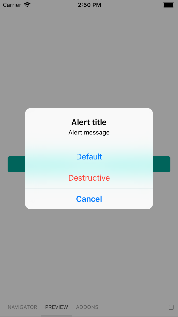 |
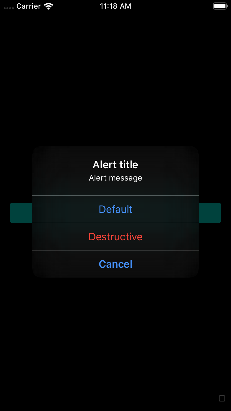 |
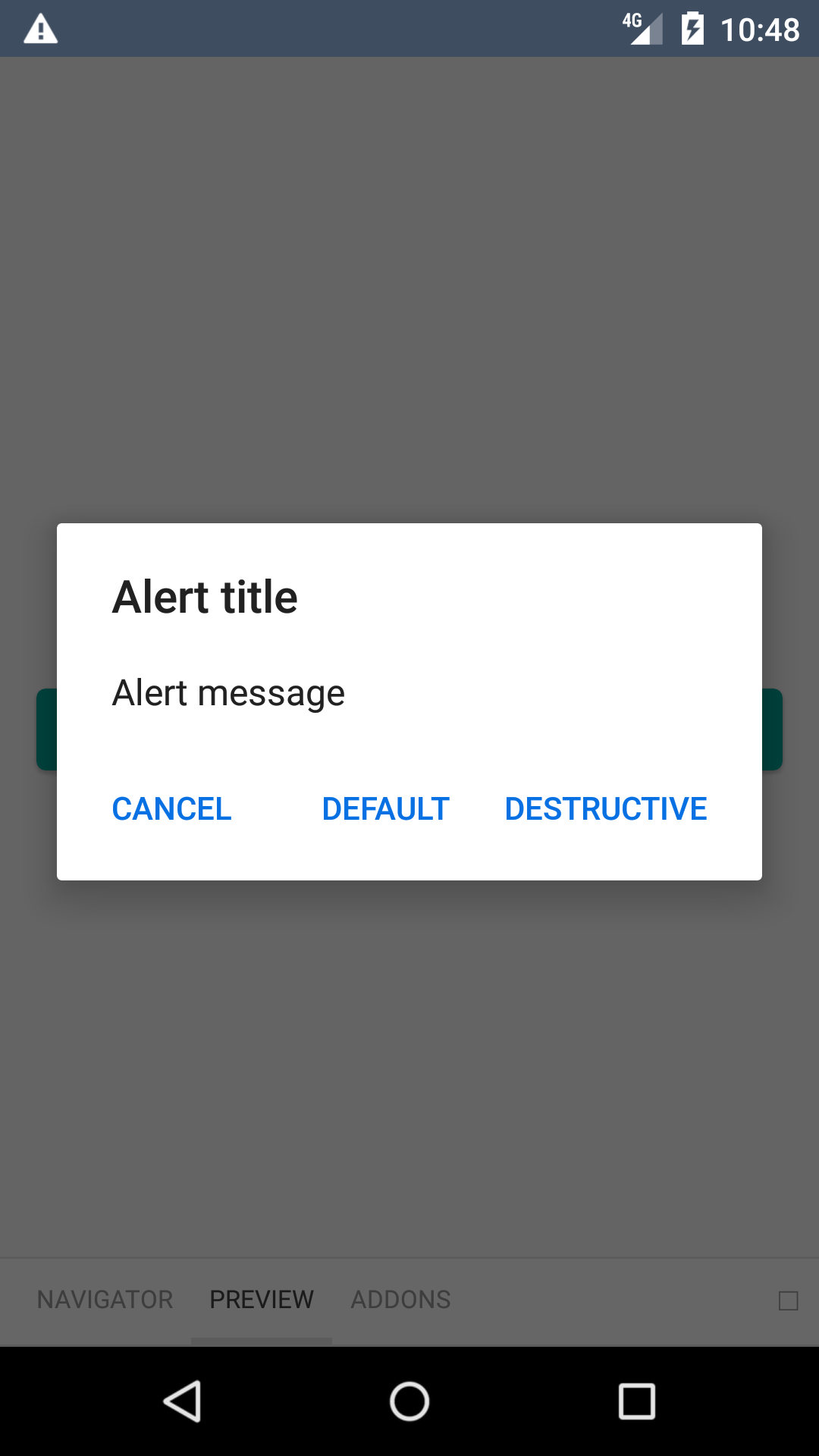 |
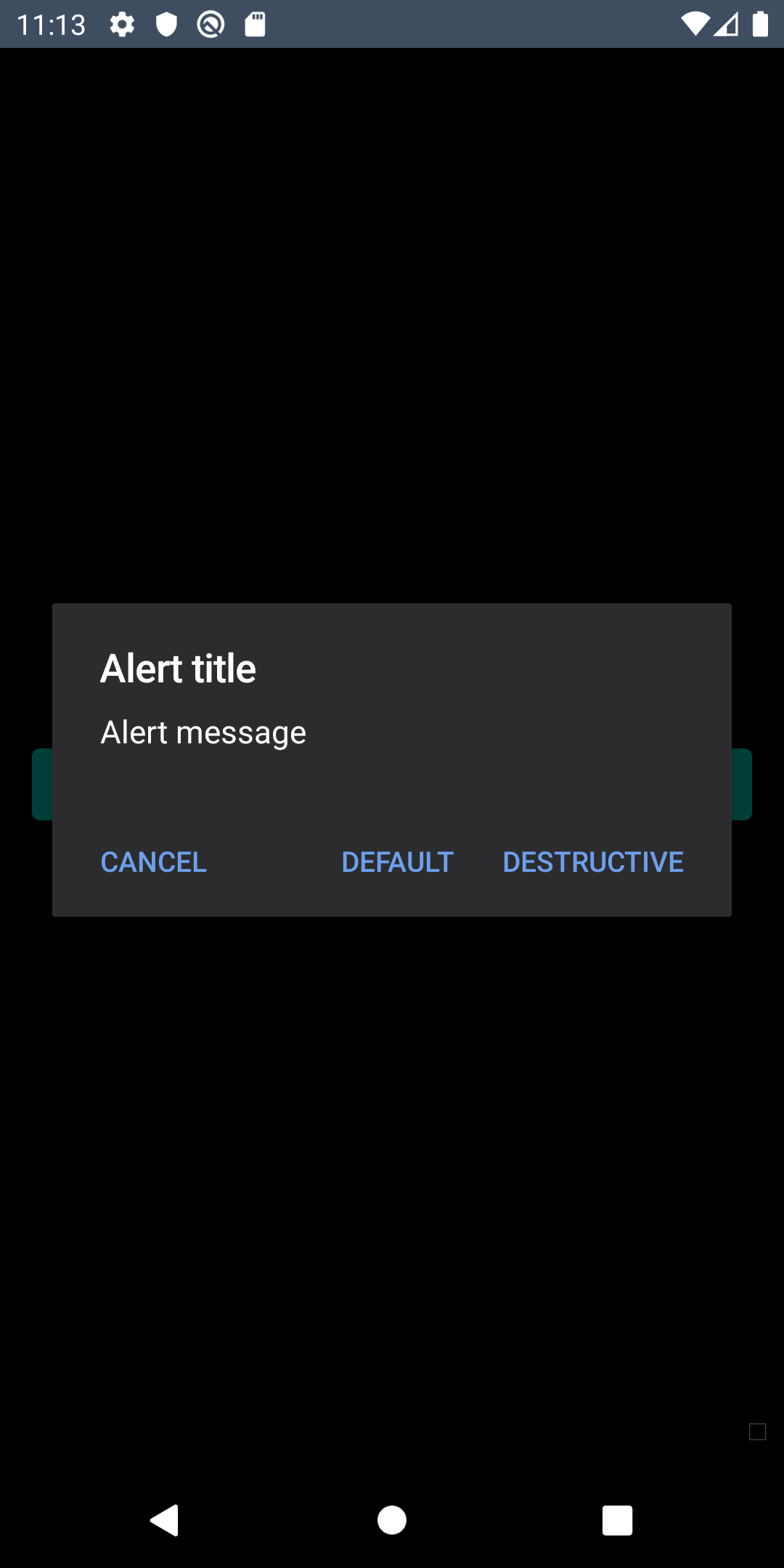 |
Installation
Check the main Readme for a complete installation guide.
Usage
                                                import BpkAlert
                                                import React, { Component } from 'react';
                                                import BpkAlert from 'backpack-react-native/bpk-component-alert';

                                                BpkAlert.alert(
                                                  'Alert title',
                                                  'Alert message',
                                                  [
                                                    {
                                                      text: 'Cancel',
                                                      onPress: () => console.log('negative button pressed'),
                                                      style: 'cancel',
                                                    },
                                                    { text: 'Default', onPress: () => console.log('positive button press') },
                                                    {
                                                      text: 'Destructive',
                                                      onPress: () => console.log('Destructive button press'),
                                                      style: 'destructive',
                                                    },
                                                  ],
                                                  { cancelable: false },
                                                );
Theming and Dark mode
Android
To use the correct Backpack font and colours, the dialog needs to be themed in the native side. Bellow is an example theme you can use:
                                                <!-- Make sure your theme extends from `DayNight` -->
                                                <style name="AppTheme" parent="Theme.AppCompat.DayNight.NoActionBar">
                                                    <item name="alertDialogTheme">@style/AppTheme.AlertDialog</item>
                                                    <item name="android:alertDialogTheme">?alertDialogTheme</item>
                                                </style>

                                                <style name="AppTheme.AlertDialog" parent="Base.Theme.AppCompat.Light.Dialog.Alert">
                                                    <item name="android:windowTitleStyle">@style/AppTheme.AlertDialog.Title</item>
                                                    <item name="android:textAppearanceSmall">?bpkTextSmAppearance</item>
                                                    <item name="android:buttonBarButtonStyle">@style/AppTheme.AlertDialog.ButtonBar.Button</item>
                                                    <item name="buttonBarButtonStyle">@style/AppTheme.AlertDialog.ButtonBar.Button</item>
                                                    <item name="android:background">@color/bpkBackgroundTertiary</item>
                                                    <item name="android:textColorPrimary">@color/bpkTextPrimary</item>
                                                </style>

                                                <style name="AppTheme.AlertDialog.Title" parent="Base.DialogWindowTitle.AppCompat">
                                                    <item name="android:textAppearance">?bpkTextLgEmphasizedAppearance</item>
                                                </style>

                                                <style name="AppTheme.AlertDialog.ButtonBar.Button" parent="Widget.AppCompat.Button.ButtonBar.AlertDialog">
                                                    <item name="android:textAppearance">?bpkTextSmEmphasizedAppearance</item>
                                                    <item name="android:textAllCaps">true</item>
                                                    <item name="android:textColor">?bpkPrimaryColor</item>
</style>Made with ❤️ by Skyscanner © 2024
© 2024 Skyscanner Backpack. Page last updated on Dec 9, 2022, 16:37